

Color is a critical aspect of design and everyday life. It can draw your eye to an image, evoke a certain mood, or communicate a message. Print and web designers have followed color theory for years, but anyone can learn more about it.
It can help you feel more confident in various situations, such as choosing colors for print design. All you need to remember is with a little knowledge and insight; you will be looking at the world in a new way. Today, we will be looking at two specific color models that are used in print. The two most common color models are RBG and CMYK. With that said, it’s essential to know which one to use and for what purpose.
RGB
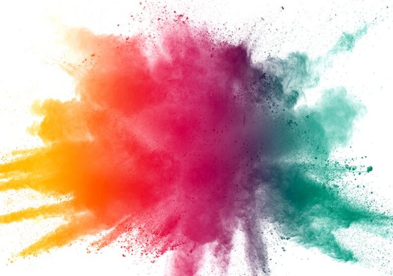
Img source: gflesch.com
RGB is red, green, and blue, and it’s primarily used for anything that is displayed on a monitor or screen. The screen that you’re reading this blog on is made out of millions of pixels. Furthermore, every pixel is broken down into three sub-pixels that are either red, green, or blue.
These sub-pixels are added in various combinations to make an array of different colors for the pixel. For example, if the red and green sub-pixels are turned on all the way, the resulting pixel would be yellow. On the other hand, if the pixel was dim, and the blue pixel was turned on all the way, then the color would be purple. All three of these sub-pixels combined will create white, which is why RGB is known as the additive color model.
RGB has a much wider color range than CMYK, and it’s known as the color gamut. When you’re designing a piece of art, you need to understand where that is going to be seen. If it’s purely going to be for on-screen use, then you should design your artwork using the RGB color model. However, if you’re going doing something that will be for on-screen and print, or solely printed, then you need to use the CMYK color model. The reason for this, as mentioned before, RGB has a wider color range. Therefore, if you were to design something in the RGB mode that has bright oranges or greens, and transfer that over to the CMYK model, it would mute down the colors you have.
Now you’re probably asking yourself, I want that bright color, but how do I get that bright color on to my printed material? The method for doing that is by using spot colors. Then, you print spot colors using Pantone ink, which we will cover later in this blog.
CMYK
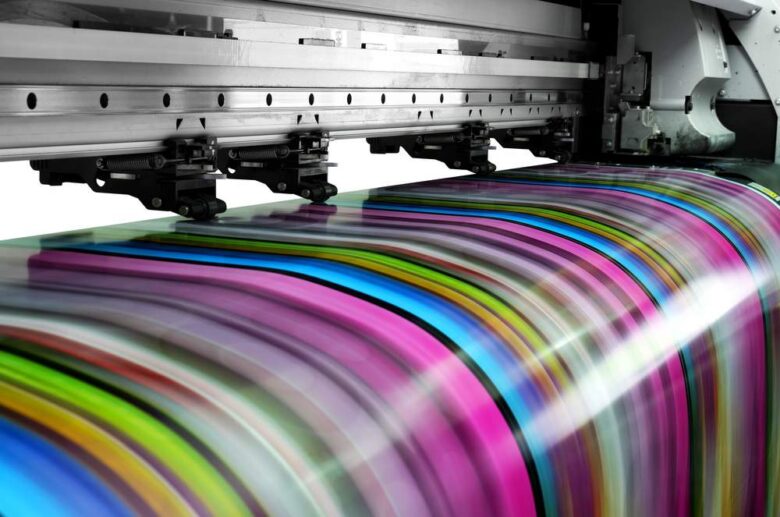
Img source: sherwooduniversal.co.uk
On the contrary, CMYK is a subtractive color model and creates white by subtracting colors. CMYK stands cyan, magenta, yellow, and key, which is black. CMYK should always be used for anything printed with ink. CMYK begins with a lighter page, typically white. Then, each color together until the final image is produced. For example, an image is made up of tiny dots of either cyan, magenta, yellow, or black. The larger the dot, the more that color will be displayed. The more colors that overlap, the darker that section of the image will be.
For this reason, it’s always better to design in the CMYK color space. This way, your printed materials will match what you see on your computer screen. When you work in CMYK, you may notice a color shift between artwork and photos that were initially produced in RGB.
So when you’re printing, you always want to make sure to set your images to be CMYK. For instance, if you’re trying to print an image, the screen can render those bright red and greens beautifully. However, a printer isn’t going to be able to. Colors look entirely different in print; then they do on the screen. Therefore, it’s better to find that out sooner than later. Otherwise, you will be in for a very unpleasant surprise. When you’re preparing documents for print, you need to pay attention to the bleed area and trim.
Your trim line is where the printer is going to cut the paper. However, if you go to the edge of the paper, you will have to leave a bleed of 1/8 to ¼ of an inch. Therefore, if the paper ends up moving slightly, the image just won’t stop, leaving you with a plain white line on the edge of your paper.
Pantone Colors
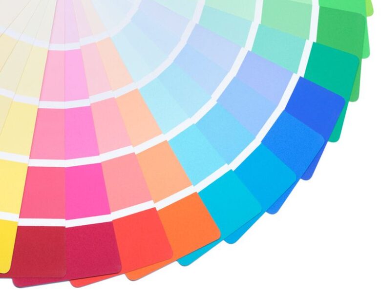
Img source: kakopedija.com
In addition to CMYK printing, you can also print with Pantone colors. These are specific color inks, and they are more accurate when trying to achieve the desired color that CMYK can’t do. Pantone colors also contain metallic inks that CMYK cannot produce.
Conclusion
When designing for print, make sure to set up the artwork in CMYK and don’t convert it later. You should also keep in mind that you’re viewing the CMYK file on an RGB screen. Therefore, the final product may vary from what you see on your screen. Everywhere you look, there is color. At times, it can feel intimidating to use it in your print design, but it doesn’t have to be.
Having a better understanding of RGB and CMYK will help you take your printing to the next level. Whether you realize it or not, colors are one of the best forms of advertising and can engage your product or business with your consumer. There are numerous aspects of color when it comes to print and design.
As you gain more experience with using color and the two-color models discussed above, choosing colors will feel like second nature. After reading this blog, hopefully, you have a better understanding of the various aspects of print and design.
Lastly, when you’re deciding between RGB and CMYK, you will always need to figure out what the output will be. If you’re working on a computer screen, then RGB will be the better solution for you. If you’re creating something for print, then you’re going to want CMYK. If you have any more questions, there are a vast amount of resources that are available to you. There is also plenty of professional printing services that can help you to bring your vision to life. When looking for the best Orlando print shop, visit Xerocopy for more information. We can help you with all your large-format printing needs.


