
In the financial technology world, design is extremely important. In fact, according to a study by J.D. Power, 77% of banking app users say that they would be more likely to recommend their bank to others if it had a well-designed app. But design isn’t just about how an app looks–it’s also about how it works. A fintech app needs to be easy to use, easy to navigate, and most importantly, secure. After all, people are entrusting their hard-earned money to the app, so it needs to be able to keep it safe.
That’s why fintech app designers have to strike a balance between making the app visually appealing and making sure that it functions correctly. Get one of those aspects wrong, and you’re likely to lose customers. Get both rights, and you’ll have a fintech app that people will love to use and that will help you attract new customers and grow your business.
5 Best Practices UI Design for a FinTech App
Steve Jobs once said, “Design is not just what it looks like and feels like. Design is how it works.” And he would know. The banking application design needs to be clean and sleek so that users can easily navigate through it without any confusion. Everything from the sign-up process to the transaction history needs to be straightforward. Otherwise, users will quickly lose interest and move on to another banking app. In today’s competitive market, you need to make sure that your app is not only visually appealing but also user-friendly if you want to attract and retain customers. The modern tactics described below will help with this.
1. Use simple language and explanations

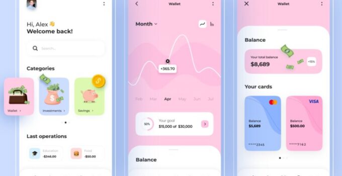
Source: zapier.com
When it comes to banking applications, it’s important to design with clarity and simplicity in mind. This is because finance is a complex field, and you want to make sure that all text in the app is easy to understand for everyone. However, there will be some unavoidable terms that might be hard to understand, like overdraft, prolongation, or LTV Calculator. In these cases, it’s important to have a glossary of definitions and related terms available within the app. Where you can do without complex concepts, do so. Try to avoid confusion at all costs.
2. Flow
Fintech companies need to remember that, when it comes to finances, people can be very overwhelmed. Try not to inundate your users with tasks all at once. Instead, use a more gradual structure. For example, you can ask the user for basic personal information like their name and birthdate in the first part of the process. Then, provide them with a draft of the service you’re about to provide – like a preliminary mortgage calculation on a mortgage service website. If they like what they see, they can move on to the second stage and provide all the necessary financial information. By breaking down the process into smaller steps, you can make it less overwhelming for users and more likely that they’ll stay engaged with your fintech product.
Presenting information in small chunks improves the look and feel of your app. By adding graphic elements (reports, the ratio of spending on different categories of goods, etc.), the application will quickly convey the necessary information to a person.
3. Colors
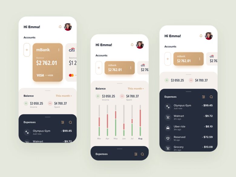
Source: merixstudio.com
The importance of color in design cannot be understated. From brand recognition to user experience, color plays a crucial role in how users interact with products and messages. Studies have shown that 60% of people decide whether they are attracted to a product or message based on color alone. Moreover, research shows that color can increase brand recognition by up to 80%. In 2017, according to ComScore, 21% of millennials said they deleted an app simply because they didn’t like how it looked on their screens!
Of course, one can argue that color is a matter of taste. But keep in mind that some basic rules of color combination are almost always valid, so take a good look at the color wheel, and learn about basic color schemes. Remember not to use colors that are too bright, as they can badly affect the users’ eyes. By taking the time to understand the role of color in design, you can create products and messages that are more likely to engage and resonate with your audience.
The colors used in an app’s design can send a powerful message to users, even on a subconscious level. As such, it’s important to choose colors that will be appropriate for the country or culture where the app will be used. For instance, in Switzerland, red and yellow are associated with money and wealth. In Western cultures, red is often seen as a symbol of energy and passion, while in Russia it may be seen as a symbol of communism and revolution. Similarly, purple is often seen as a symbol of piety and faith in Western cultures, while in Brazil and Thailand it is considered to be the color of mourning.
4. Proper adaptation to the screen size

Source: toptal.com
Financial apps have to be able to display large amounts of data like reports, statistics, investment reports, etc. in large tables. This is why, while developing both the web and mobile versions of an app, a fintech development company has to remember that these sheets should be adequately displayed on a screen so that customers can navigate and make sense of them. They should be scalable and readable, logically built, and not too overloaded with data. Too much information can be overwhelming for users, so it is important to make sure that only the most relevant data is displayed prominently.
It’s no secret that responsive design is important for modern websites. With the proliferation of mobile devices, it’s now more important than ever to make sure that your website can be accessed on any screen size. However, designing a responsive website can be a challenge, especially if you’re working with a limited budget. Fortunately, there are a few things you can do to ensure that your responsive website is up to snuff.
- Make sure that all of the content on your website can be easily accessed on any screen size.
- Research which devices are most popular in the country where your website will be accessed. This will allow you to focus your design efforts on devices that are being used.
- Be sure to set your app’s numeric fields to decimal. This will allow users to enter fractional digits, which can be critical for calculations.
5. Add gamification
It’s no secret that everyone loves playing games and getting the thrill of the win. Gamification is merely exploiting this natural tendency for your app’s benefit. Gamifying a fintech app involves using gaming mechanics to make the user experience much more exciting and rewarding.

Source: elearningindustry.com
It’s one of the surefire ways to turn a “boring” fintech app into something your users will want to engage with every day. And if you think gamifying an app is only a fun gimmick for a younger audience, think again. A study by Finances Online showed that 97% of employees aged 45 and older believed that gamification improved their work.
Development of a banking application is a complex task and UI design should take one of the first positions on the list of priorities. This is a really important ingredient for success.


 in Blockchain – 2024 Guide")